In our fast-paced world filled with constant demands and digital noise, finding instant relief from stress has become more essential than ever. Color-based calm-down prompts offer a scientifically-backed pathway to transform overwhelming anxiety into peaceful serenity within moments.
The connection between colors and our emotional state runs deeper than mere aesthetic preference. Our brains are wired to respond to different wavelengths of light, triggering specific neurological and hormonal responses that can either elevate stress or promote profound relaxation. By understanding and harnessing this natural phenomenon, you can create your own personalized toolkit for instant stress relief, accessible anywhere and anytime you need it most.
🎨 The Science Behind Color and Emotional Regulation
Color psychology isn’t just New Age theory—it’s rooted in solid neuroscience. When light enters our eyes, it travels through the retina to the hypothalamus, the brain region responsible for regulating hormones, body temperature, and emotional responses. Different colors trigger distinct neurochemical reactions that directly influence our mood, heart rate, and stress levels.
Research published in the Journal of Environmental Psychology has demonstrated that exposure to certain colors can measurably reduce cortisol levels—the primary stress hormone in our bodies. Blue tones, for instance, activate the parasympathetic nervous system, which controls our rest-and-digest response. Meanwhile, green hues have been shown to reduce anxiety by up to 30% in clinical settings.
Understanding these biological responses empowers you to use color strategically as a tool for emotional self-regulation. Rather than being passive victims of stress, we can actively engage our visual cortex to shift our physiological state from tension to tranquility.
Creating Your Personal Color Calm-Down System
Building an effective color-based relaxation practice doesn’t require expensive equipment or extensive training. The key is developing personalized prompts that resonate with your unique nervous system and lifestyle demands. Start by identifying which colors naturally make you feel most peaceful and grounded.
Blue: Your Gateway to Instant Calm ☁️
Blue remains the most universally calming color across cultures and demographics. This cool-toned hue naturally lowers blood pressure, slows rapid breathing, and reduces heart rate. When stress strikes, visualizing or gazing at blue can provide immediate relief.
Create a blue calm-down prompt by photographing blue skies, ocean waves, or even painting a small blue swatch on an index card to keep in your wallet. When anxiety rises, focus on your blue prompt for 60-90 seconds while taking slow, deliberate breaths. This simple technique activates your body’s natural relaxation response.
Green: Nature’s Stress Antidote 🌿
Green occupies the center of the visible light spectrum, requiring minimal eye strain to process. This makes it inherently restful for our visual system. Evolutionary psychologists suggest our positive response to green stems from its association with fertile environments where resources are abundant and threats are minimal.
Incorporate green calm-down prompts by keeping a small plant on your desk, using green screensavers, or collecting images of lush forests and meadows. When overwhelmed, spend three minutes contemplating green imagery while mentally releasing tension with each exhale.
Soft Pink: The Compassion Color 💗
While often overlooked in stress management discussions, soft pink has remarkable calming properties. Studies in correctional facilities have shown that pink rooms can reduce aggressive behavior and promote emotional regulation within minutes. This gentle color combines the passion of red with the purity of white, creating a soothing effect that encourages self-compassion.
Use pink calm-down prompts during moments of self-criticism or emotional distress. A pink sticky note, rose quartz stone, or saved image of cherry blossoms can serve as visual reminders to treat yourself with kindness during stressful moments.
Implementing Color Prompts Throughout Your Day
The true power of color-based calm-down techniques lies in their accessibility and ease of implementation. Unlike meditation apps that require headphones and privacy, color prompts can be deployed instantly in any environment—from crowded subway cars to high-pressure meetings.
Morning Ritual: Setting Your Stress-Free Tone
Begin each day with a two-minute color visualization exercise. Before checking your phone or email, close your eyes and visualize your chosen calm color enveloping you like a protective cocoon. Imagine breathing in this color, allowing it to fill your body from toes to crown, establishing a baseline of serenity before daily stressors arise.
Consider designating a specific color for each day of the week, creating variety while building a structured practice. Monday might be blue for calm transitions, Wednesday could be green for mid-week renewal, and Friday might be soft yellow for optimistic energy heading into the weekend.
Workplace Stress Busters
The modern workplace presents endless stress triggers—demanding emails, tight deadlines, interpersonal conflicts, and performance pressure. Strategic placement of color prompts in your workspace creates instant access to emotional regulation tools precisely when you need them most.
Place a colored object within your direct line of sight: a turquoise pen holder, a lavender notebook, or a green desk plant. When stress escalates during the workday, pause for 30 seconds to focus exclusively on your chosen object. Notice its exact shade, how light reflects off its surface, and how your breathing naturally deepens as you concentrate on this single point of calm.
Evening Wind-Down Protocols 🌙
The transition from day to evening often carries residual stress that interferes with sleep quality and family relationships. Create an evening color ritual that signals to your nervous system that the workday has ended and relaxation can begin.
Dim lighting naturally shifts toward warmer, amber tones that promote melatonin production. Incorporate soft purples and deep blues into your evening environment through throw pillows, candles, or wall art. Spend 5-10 minutes before bed gazing at calming colors while practicing progressive muscle relaxation, releasing the day’s accumulated tension.
Advanced Color Combination Techniques
As you become more proficient with single-color prompts, experiment with color combinations that create layered calming effects. Certain color pairings work synergistically to produce deeper relaxation than individual colors alone.
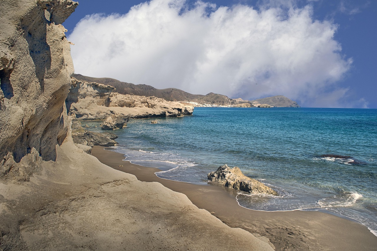
Blue and Green: The Ultimate Tranquility Blend
Combining blue and green—think tropical ocean waters meeting lush coastlines—creates what color therapists call the “paradise effect.” This combination simultaneously activates multiple calming pathways in the brain, providing comprehensive stress relief. Seek out images of turquoise waters, peacock feathers, or sea glass to leverage this powerful pairing.
Lavender and Cream: Gentle Restoration
The soft combination of lavender and cream tones promotes both calmness and gentle energy restoration. This pairing works exceptionally well for managing stress-induced fatigue, when you need to feel relaxed yet alert rather than sedated. Keep a lavender sachet with a cream-colored ribbon as a portable calm-down prompt for afternoon stress management.
Digital Tools for Color-Based Relaxation
While physical color prompts offer tangible stress relief, digital applications can provide structured guidance and expanded options for color-based calm-down techniques. Several apps specialize in chromotherapy and visual relaxation exercises designed for modern stress management.
Look for applications that offer customizable color meditation sessions, allowing you to select duration and color focus based on your immediate needs. The best apps combine color therapy with breathing exercises, creating multisensory relaxation experiences that address stress from multiple angles simultaneously.
Overcoming Common Obstacles to Consistency
Like any wellness practice, color-based stress management requires consistency to produce lasting results. Many people start enthusiastically but abandon the practice when immediate transformation doesn’t occur. Understanding common obstacles helps you maintain your practice through initial challenges.
The Skepticism Barrier
If you find yourself doubting whether simply looking at colors can genuinely reduce stress, you’re not alone. Our culture emphasizes complex solutions over simple ones, making us skeptical of accessible techniques. Remember that neuroscience validates the color-emotion connection—your skepticism doesn’t negate the biological reality of how your brain processes visual stimuli.
Commit to a 14-day experiment without judgment. Use color prompts consistently for two weeks while noting any shifts in stress levels, sleep quality, or emotional resilience. Let your personal experience override intellectual skepticism.
Environmental Limitations
Some workplaces or living situations may not accommodate visible color prompts. In these cases, create a digital folder on your phone with calming color images you can access discretely. A quick 20-second glance at a serene blue landscape during a bathroom break can provide significant stress relief without drawing attention.
Measuring Your Progress and Refining Your Practice 📊
Tracking your stress levels and relaxation progress helps maintain motivation and identifies which color prompts work most effectively for your unique nervous system. Create a simple rating system from 1-10 to assess your stress level before and after using color calm-down techniques.
Keep a brief journal noting which colors provided the most relief during different types of stress—anxious stress versus angry stress versus overwhelmed stress. You may discover that blue works best for anxiety while green excels for overwhelm, allowing you to match specific colors to particular emotional states.
Building a Comprehensive Stress-Resilience Strategy
Color-based calm-down prompts work most powerfully when integrated into a broader stress management approach. While colors provide instant relief, combining them with other evidence-based practices creates lasting resilience against chronic stress.
Pair your color practice with regular physical movement, adequate sleep, meaningful social connections, and mindfulness techniques. Think of color prompts as the emergency brake for acute stress moments, while these other practices build the overall stress-resistance infrastructure of your life.
Creating Color Anchors for Challenging Situations
Anticipate high-stress situations by establishing color anchors beforehand. If you have a difficult conversation approaching, spend two minutes visualizing a calming color surrounding you like protective armor. During the actual stressful event, you can mentally return to this color anchor, accessing the calm state you pre-established.
This technique proves particularly valuable for recurring stressors—weekly meetings, difficult commutes, or challenging family dynamics. Over time, the color anchor becomes automatically associated with staying grounded during these predictable stress triggers.
Your 7-Day Color Calm Transformation Plan 🗓️
Ready to experience the stress-relieving power of color prompts? This structured week-long plan helps you build a sustainable practice while exploring different colors and techniques:
- Day 1: Select three calming colors that intuitively appeal to you. Gather physical or digital examples of each.
- Day 2: Practice morning color visualization for 2 minutes. Notice how this affects your early-day stress levels.
- Day 3: Introduce workplace color prompts. Use them at least three times throughout your workday.
- Day 4: Experiment with color combinations. Create a calming image that blends two soothing colors.
- Day 5: Establish an evening color wind-down ritual. Practice for 5 minutes before bed.
- Day 6: Use color prompts during an actually stressful moment. Document the experience and effectiveness.
- Day 7: Reflect on the week. Identify which colors and techniques provided the most relief, then design your ongoing practice.
Embracing Color as Your Lifelong Stress Companion 🌈
The beauty of color-based calm-down prompts lies in their permanent accessibility. Unlike stress management tools that require specific locations, equipment, or circumstances, colors surround you constantly. The sky, your clothing, artwork, nature, and digital devices all provide endless opportunities for stress relief.
As you develop this practice, you’ll find that your sensitivity to color’s emotional impact increases. You’ll naturally gravitate toward calming hues during stressful periods and may even restructure your environment to support ongoing serenity. This isn’t escapism—it’s intelligent design of your sensory experience to support your mental health and emotional well-being.
The transformation from stress to serenity doesn’t require dramatic life changes or expensive interventions. Sometimes, the most powerful shifts come through simple practices consistently applied. By training your attention to engage with calming colors intentionally, you’re literally rewiring your stress response pathways, creating new neural patterns that favor peace over panic.
Start today with whatever color calls to you in this moment. Take sixty seconds to truly see it, breathe with it, and allow it to shift something subtle inside you. That small moment of color-focused calm is your first step on a path toward instant relaxation whenever you need it most. Your journey from stress to serenity through color begins now—one mindful glance at a time.